Monday, April 11, 2011

Final Project

My final project is a cd packaging case for my photography business, Gordon Maxey Photography. About the only requirement in the project was that we make something that folds (that something could not be generic like a tri-fold brochure). My packaging case will have a pouch where the disk will go and a fold on the cover for reinforcement. With this project I want to make my photography package more appealing. Clients will not only get a disk, but it will come in a custom case with their photos in the design. It is aimed at predominately females, ages 20-30 who are getting married. And I hope that it will be another reason to pick me as a photographer. I based all my dimensions off of a case that I already had, and laid it out according to that.

I manually measured out folded cd cases and cd's of my own to decide on a size. After laying it out in InDeign, I realized that I would have to alter my layout just a little to accommodate paper sizes. This is why I moved the flap above instead of the whole thing being linear. Here is my final cd case and cd design.


This is the final layout I decided on.


Here are the layout thumbs that I thought to be possibilities.


All images copyright by Gordon Maxey, Gordon Maxey Photography 2010

Wednesday, April 6, 2011

Publication Advertisement


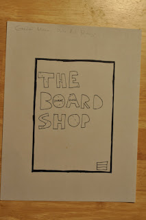
I started with research in the publication ad assignment. I first had to look up ad specifications for the desired magazine that I wanted to advertise in. Each magazine has different size specifications and different costs. Transworld Wakebaording Magazine had their media kid as a downloadable PDF, which is where I based not only the specifications for my ad, but the content as well. Again, The Board Shop was a perfect fit for this project. And again, it is aimed at men and women ages eighteen to twenty-five. In a full page ad I wanted my design to be iconic. Something that is easily recognizable, and something that would stand out among pages and pages of other advertisements. As you can see, my final piece is different from my rough. I strayed from my original concept because I felt that with the simplicity of the photo, that the idea was missed with knock-out text over it.

So here is what finished with as my final ad.


After Deciding on a design I had to find the specifications for my publication. Transworld Wakeboard Magazine has a downloadable PDF that lists all of their advertising specifications. This is where I based my sizes when moving on to creating the files.


My rough, although hard to see, is an image with knock-out text above it. The top layer will be black with the letters knocked out, and the image beneath it will make The Board Shop readable.


Here are my first thumbnail sketches.


All images copyright by Gordon Maxey, 2011